

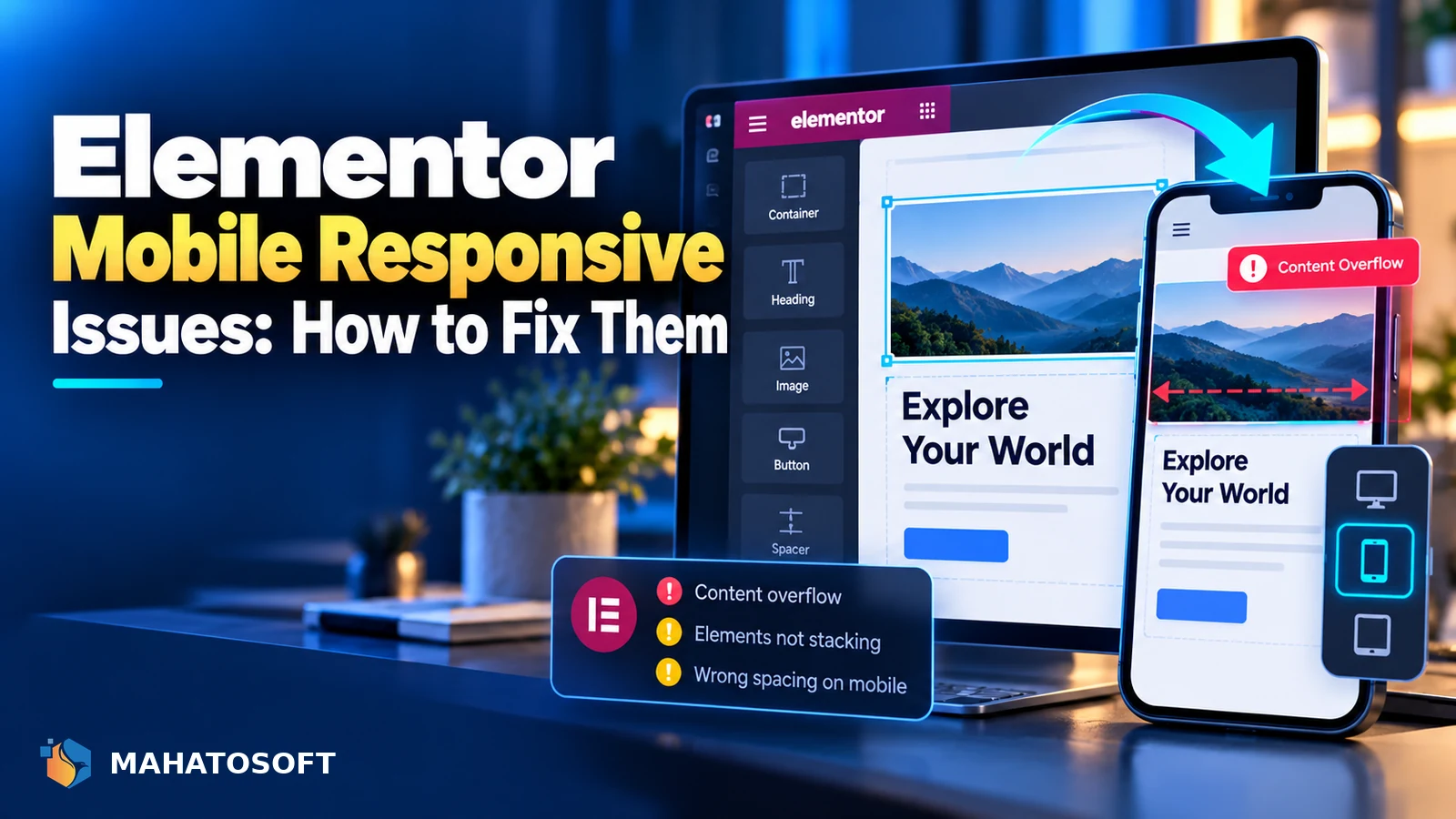
An Elementor mobile responsive problem usually means the page looks right on your desktop screen but breaks, overlaps or hides content once it is viewed on a phone. Elementor gives you full control over each screen size, but that control only helps if you actually check and edit each breakpoint. Here is how to find and fix the usual culprits.
Some links in this article are affiliate links. If you buy through them, Mahatosoft may earn a small commission at no extra cost to you.
Elementor renders the same layout at every screen width unless you tell it otherwise. Padding, column widths, font sizes and even whether an element shows at all can all be set per device, and it is easy to build a page on a large monitor and never look at it on a phone until a visitor complains.
Check with the editor’s own preview first
Open the page in Elementor and click the device icons at the bottom of the panel to switch between Desktop, Tablet and Mobile. This shows you the actual breakpoint Elementor uses, which is more reliable than resizing a browser window.
How Elementor decides what counts as mobile
Elementor’s default setup uses three views: Desktop, Tablet (screens narrower than 1024px) and Mobile (screens narrower than 768px). Elementor Pro lets you add extra breakpoints, such as Mobile Extra, Tablet Extra, Laptop and Widescreen, from Site Settings → Layout → Breakpoints, which is worth doing if your visitors use a wide range of phone and tablet sizes.
Every setting you change while a specific device is selected in the editor applies only to that breakpoint and anything narrower than it, unless you override it again at a smaller size. Elementor’s own guide to responsive editing for mobile and tablets covers the mechanics in more detail.
Common elementor mobile responsive problems
| Symptom | Usual cause |
|---|---|
| Columns do not stack on mobile | Columns set to a fixed width or content wrapped in a container without a mobile direction change |
| Text is too small or too large | Font size set once on Desktop and never adjusted for Mobile |
| Images or background stretch oddly | A background image or fixed-height section without a mobile-specific setting |
| Elements overlap | Negative margins or absolute positioning that only works at wide widths |
| Something is missing on mobile | The element’s visibility was turned off for that device, sometimes by accident |
| Horizontal scroll bar appears | An element wider than the screen, often a full-width image or a fixed pixel width |
Fix columns and sections that will not stack
On a phone, columns should normally stack one above another rather than staying side by side. If a section is not stacking, check the Layout tab on the section or container while Mobile is selected: older section-based layouts have a “Reverse Columns” and stacking behaviour, while the newer container layout uses Direction, which should usually switch to Column on mobile so items stack vertically.
Fixed pixel widths on a column or widget stop it from shrinking. Switch fixed widths to percentages, or remove the width override on mobile so the element can use the full row.
Fix text sizing across devices
Set a font size for Desktop, then switch to Tablet and Mobile in the editor and adjust each one rather than assuming Elementor will scale it for you automatically. As a starting point, headings usually need to drop by a third to a half between desktop and mobile, and line length should stay short enough to read without zooming.
Fix spacing, margins and overlaps
Large desktop padding and negative margins used for overlapping design effects are the most common cause of elements colliding on mobile. Select Mobile in the device switcher, then reduce padding and margin values, and remove or reduce any negative margin that was used to pull one element over another on a wide screen.
Absolute-positioned elements, such as a badge or button placed manually over an image, often need a separate position on mobile too, since the image itself will be a different size and shape.
Check what is hidden on each device
Elementor lets you hide any widget, column or section on a specific device from the Advanced → Responsive settings. This is useful for removing a decorative element on mobile, but it is also the most common reason content “disappears” unexpectedly: a setting toggled during editing and never turned back on. Check every hidden element on the page is hidden on purpose. Accidentally hidden content is one of the sneakiest elementor mobile responsive bugs, since the page looks complete in the editor and only breaks for actual phone visitors.
Fix images and background sections
A background image set to “cover” on desktop can crop awkwardly on a narrow, tall phone screen. Switch to Mobile and adjust the background position, or use a shorter, more centred image specifically for mobile if the desktop crop loses important content. For content images, letting Elementor use its responsive image sizes rather than a single large fixed-size upload also helps page speed on mobile, which affects Core Web Vitals as well as layout.
Fix menus, buttons and forms on touch screens
A navigation menu that works with a mouse hover does not work the same way on a touch screen, since there is no hover state on a phone. Check that dropdown menus open with a tap, that the mobile menu icon (the “hamburger” menu) is set up in your theme or in Elementor’s Nav Menu widget, and that buttons are large enough to tap accurately, ideally at least 44 by 44 pixels.
Forms are another common elementor mobile responsive weak point. A multi-column form that looks tidy on desktop often needs to switch to a single column on mobile so fields do not become too narrow to use comfortably.
Test on real conditions, not just the editor
The editor’s device preview is a good first check, but it runs on your desktop’s network speed and rendering engine. Before calling a page finished, check it on an actual phone, and use Chrome DevTools’ device toolbar with network throttling for a closer approximation of a mobile visitor’s experience, since that final check is what actually confirms an elementor mobile responsive fix works outside the editor. MDN’s guide to responsive web design is a useful reference for the CSS concepts behind Elementor’s breakpoints. If the page also loads slowly on mobile, look at whether an Elementor site is generally running slow beyond just layout.
Want a mobile-perfect page without the trial and error?
We build and fix Elementor landing pages and full WordPress sites that work properly on every device. See the Elementor Pro landing page service or contact us with your page URL.
Elementor mobile responsive: quick answers
Why does my Elementor site look fine on desktop but broken on mobile?
Because Elementor applies desktop settings as the base, and anything you have not specifically adjusted for Tablet or Mobile inherits those desktop values. Fixed widths, large padding and negative margins are the most common causes.
How do I make an Elementor mobile responsive layout without rebuilding the page?
Switch to the Mobile device view in the editor and adjust the settings that are causing problems, such as direction, width, padding and font size, rather than rebuilding the section. Most fixes are a few minutes of adjustment per section, not a full redesign.
Does Elementor automatically make pages mobile responsive?
Elementor’s structure is responsive by default, meaning columns can stack and widgets can resize, but it does not automatically choose the best settings for every design. You still need to review and adjust each breakpoint yourself.
Can I add more breakpoints than Mobile, Tablet and Desktop?
Yes, with Elementor Pro. Go to Site Settings → Layout → Breakpoints to add options like Mobile Extra, Tablet Extra, Laptop and Widescreen for finer control across more screen sizes.


Discussion
Join the conversation
No comments yet. Share a question or what worked for you.