

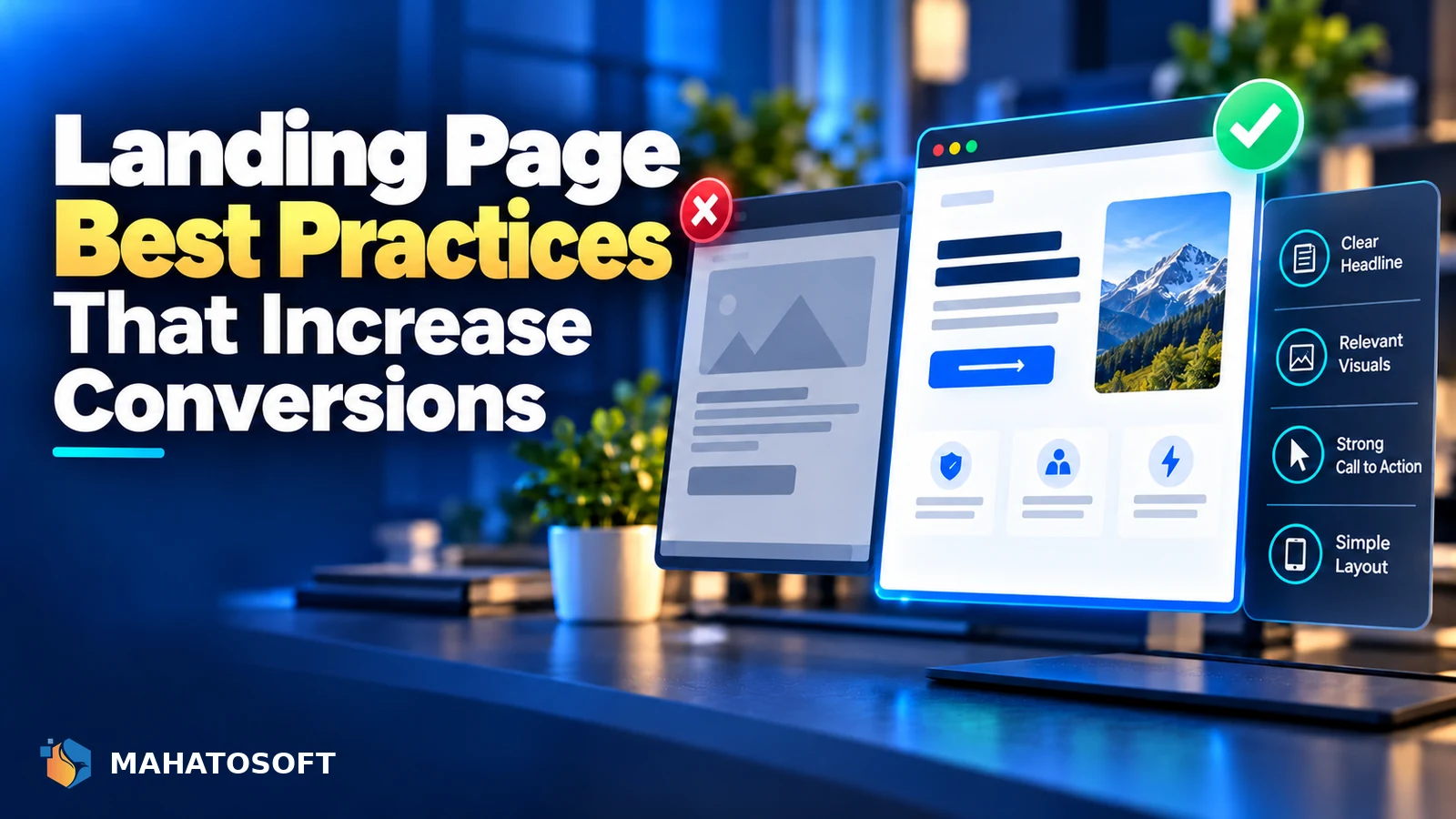
A landing page has one job: get the visitor to take one specific action. Following proven landing page best practices matters more here than on any other page type, because every extra distraction, every unclear sentence and every second of load time directly costs you conversions.
Some links in this article are affiliate links. If you buy through them, Mahatosoft may earn a small commission at no extra cost to you.
Unlike a homepage, which has to serve many different visitors with many different intents, a landing page is usually built for one traffic source and one offer. That focus is what makes the best practices below effective; the same techniques applied to a homepage often do not translate directly.
Match the page to the ad or link that sent them
If a visitor clicked an ad promising “20% off winter boots,” your landing page headline should say exactly that, not a generic welcome message. A mismatch between the click and the page is one of the fastest ways to lose a visitor who was already interested, and it is one of the simplest landing page best practices to check before blaming anything more complicated.
1. Landing page best practices start with one goal
Decide the single action you want: a purchase, a signup, a booking, a download. Every element on the page should either support that action or get removed. A landing page with a main navigation menu, a footer full of links, and three competing offers is asking the visitor to do your job of deciding what matters.
2. A headline that states the offer plainly
The headline is the first, and sometimes only, thing a visitor reads before deciding whether to stay. State what the offer is and who it is for in plain language, rather than a clever line that requires the visitor to keep reading to understand it. A subheadline underneath can add the specific detail or benefit that the main headline does not have room for.
| Weak headline | Clearer headline |
|---|---|
| “Welcome to Our Amazing Service” | “Get Your Website Live in 5 Days, From $450” |
| “The Future of Fitness” | “4-Week Beginner Strength Program, First Class Free” |
3. Put the essentials above the fold
A visitor should understand what you are offering and see the call to action without scrolling, especially on mobile, where most landing page traffic now arrives. This does not mean cramming everything into the first screen; it means the headline, a one-line explanation, and the primary button all appear before the visitor has to scroll.
4. Real social proof, placed where doubt happens
Testimonials, review counts, logos of businesses you have worked with, or case numbers all reduce the hesitation a visitor feels right before converting. Place proof near the point of decision, close to the form or button, rather than only at the very bottom of the page where fewer visitors scroll to see it. Only use genuine testimonials and real numbers; a fabricated statistic or quote is easy for a visitor to sense and destroys trust immediately if discovered.
5. Reduce form and checkout friction
- Ask only for the information you genuinely need at this stage. Every extra field reduces completion rate.
- Use a multi-step form for longer signups if it makes the first step feel small, rather than one long intimidating form.
- Show progress on multi-step forms, so visitors know how much is left.
- Make error messages specific (“Enter a valid phone number”) rather than generic (“Something went wrong”).
6. One clear, repeated call to action
Use one primary action, worded specifically (“Start My Free Trial” rather than a plain “Submit”), and repeat it at natural points as the visitor scrolls a longer page, rather than making them scroll back up to find the button again. Keep the button visually distinct from every other element on the page, in a colour used nowhere else.
7. Speed and mobile layout
A slow landing page loses visitors before they even see your offer, and a landing page that is hard to use on a phone loses the majority of paid traffic on most campaigns. Compress images, avoid heavy animation on the hero section, and test the actual mobile experience, not just a resized browser window. Google’s own guidance on fast-loading pages is a useful checklist if you want to go deeper on the technical side. Our guide to Core Web Vitals for WordPress covers the technical side of page speed.
8. Test changes, do not guess
Where you have enough traffic, A/B test one change at a time: headline, button colour, form length. Where traffic is too low for a reliable test, rely on qualitative signals instead, such as session recordings and where visitors stop scrolling, rather than making sweeping changes based on a hunch. Testing one variable at a time is one of the landing page best practices people skip most often, usually because it feels slower than it actually is.
Google’s own landing page guidance for Google Ads is also worth reading if your traffic comes from paid search, since a poor landing page experience can raise your cost per click even before conversion rate comes into it.
9. Do not forget basic accessibility
Following landing page best practices also means the page has to work for visitors using a screen reader or navigating by keyboard, not just visitors with perfect eyesight and a mouse. Use real form labels rather than placeholder text alone, keep colour contrast high enough to read easily, and make sure the call to action button is reachable and operable with the keyboard. These are not niche concerns; they affect a meaningful share of any large audience, and fixing them rarely conflicts with good design.
Building the page itself
Elementor’s page builder is a common choice for landing pages built inside WordPress, since it lets you design and test copy changes without a developer for every tweak. See our guide to building an Elementor landing page that converts for the build side of this once your structure and messaging are settled. Good tooling makes these landing page best practices easier to apply, but it does not replace deciding the goal and message first.
Want a landing page built to convert, not just to look good?
We build landing pages with Elementor Pro, starting from a clear conversion goal. See the Elementor Pro landing page service or book a free 15-minute call.
Landing page best practices: quick answers
What is the most important landing page best practice?
Keeping the page focused on one single goal matters more than any individual design choice. A page trying to sell three offers at once will underperform three separate pages, each built around one clear, specific goal.
Should a landing page have a navigation menu?
Usually not. Removing the main site navigation keeps the visitor focused on the one action you want, since every link out of the page is a chance for them to leave without converting.
How long should a landing page be?
As long as it needs to be to answer the visitor’s real objections, and no longer. A simple, low-commitment offer can convert with a short page; a higher-priced or unfamiliar offer usually needs more detail, proof and reassurance before someone commits.
How often should I update a landing page?
Review it whenever the offer, pricing or audience changes, and revisit the messaging periodically even without a change, since a page that performed well six months ago can quietly stop matching what your current traffic is looking for.
Discussion
Join the conversation
No comments yet. Share a question or what worked for you.